
Jonathan Minton
This article originally appeared on the OUPblog on 19 September 2013: http://blog.oup.com/2013/09/demographic-landscape-bad-news/. It is reproduced here with updated figures and captions.
In the first part of this post, I showed how we used a classic mapping technique — contour plots — to explore the demographic landscape, examining the texture of the lives and deaths of billions of people from more than forty countries. Our maps showed how a third variable, mortality rates, varied against two others: age and time. Just as the coordinates of physical terrain are latitude and longitude, so the coordinates of mortality terrain are age and year, or age-time.
Previously, we saw how these contour maps highlighted the good news we found in demographic changes. Today we explore the bad news.
Period effects: The dinosaurs of the twentieth century
Our demography has been scarred by the two World Wars. In our maps these appear as two thin clusters of ovals, like onions that have been flattened then cut open. Topographically, these oval clusters show mortality risk jutting shard-like out of the lowlands of early adulthood like the kite-shaped plates of a stegosaurus. These are period effects, disruptions to the usual order. The bathtub-shaped age-specific mortality risks for the cohorts of men who had come of age by the onset of these wars had spikes in them. Women of the same age, though protected by patriarchal gender inequality from the front line, were still exposed to much of this additional risk, especially if they had the misfortune of having one’s home located in what turned into a battlefield.
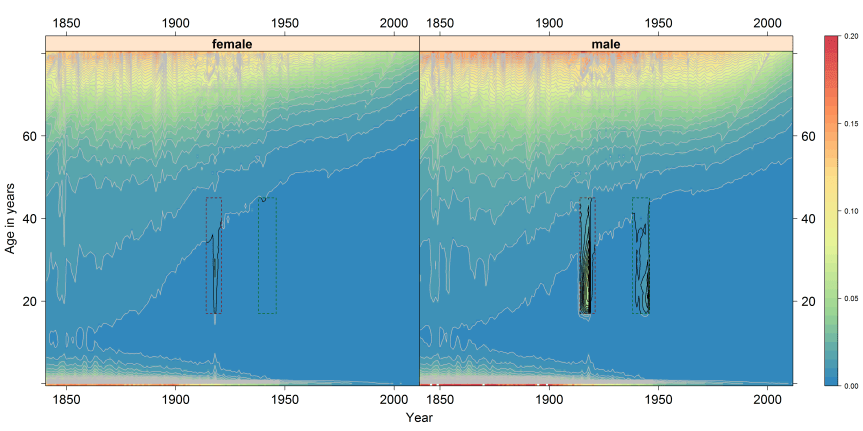
Note: Shaded contour plot of age and year specific crude mortality rates for females (left) and males (right), for each year from 1841 to 2011 and every age in single years from birth to 80 years, in England & Wales. Males and females between the ages of 18 and 45 years inclusive highlighted in a red box for World War 1; and in a green box for Word War 2. Cell shadings indicate the mortality rates using the colour scheme shown in the legend on the right, with values indicating the risk of dying in the next 12 months. Contour lines are added showing each time the risk of dying changes by 0.005 (i.e. at risks of death of 0.000, 0.005, 0.010, 0.015 and so on, up to 0.200).
War and pestilence
War and pestilence are bedfellows. The squalor of the World War I trenches and close-quarter living, the mass transport of men from country to country, poor diet and hygiene, chronic stress. These are just some of the factors which meant that young adults, usually most resilient to harm from disease, were disproportionately victims to the H1N1 influenza virus, which spread across the world in 1918.
World War II killed more in absolute terms, as by then the world’s population was much larger, but World War I killed more of those alive at the time. This was because World War I was not just a war of nation against nation, but also of pathogen against human. The H1N1 influenza virus infected around half a billion people, and killed over 50 million. The pandemic half-decimated the human race, killing up to one person out of every twenty people alive at the start of 1918.
Our maps hint at how the virus may have spread from host to host in a deadly game of conquest. Start in the trenches and roll a die. If it’s a six, then the host dies and the game is over. Role a four or a five (say) and the host recovers but stays a carrier. With fewer hosts remaining (dead or immune) a waiting game begins. A few months or years later, sooner if they’re sicker, and the host returns home. Victim one, the Soldier, passes to Victim Two, the Spouse, and the die is rolled again. If both virus and new host are still alive, then wait nine months, and Victim Three, the Child, is born. One virus, three chances.
Contour maps tell this grim story as follows: look separately at the male and female mortality maps for the same country. If males are exposed to the virus earlier and harder, then we can expect their spike to be earlier and higher — a greater concentration of ovals, slightly further to the left — than for females. There is some evidence in the maps that this took place, although as the data are reported by year rather than month the image is fuzzy.
In the contour maps, the tell-tale signs of transmission from Victim Two to Victim Three are different still. As baby boys and baby girls are about as common, and exposed to the virus at about the same time, we can expect spikes in infant mortality due to the virus to be synchronised for boys and girls, unlike for young adults where they were out of phase. We can also expect it to occur slightly after the onset of the additional mortality for females. Again, this appears to be the case.
The hidden scar
The contour maps reveal an epilogue to the above, turning a massacre into a murder-mystery. Look at the contour maps, and you will see ‘scars’ running along the south-west to north-east diagonal. Like a rake drawn across the ridges of a sand dune, the scars represent abrupt distortions to broader trends. These scars are cohort effects. They mean that, for one unlucky cohort, each of the mortality hurdles have been moved forward slightly, meaning (say) that the mortality risk that would otherwise have been faced at aged 40 is instead faced at 37; the hurdle faced at 35 is instead faced at 33, and so on, continuing all the way from childhood to old age.
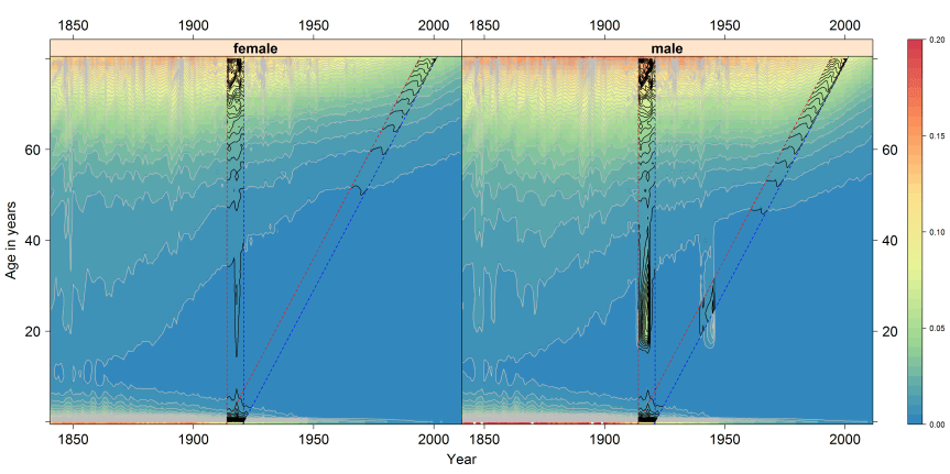
The unlucky cohort was born in the wake of World War I. The epilogue this fact tells us is that, even when babies were not killed by the privation and pestilence of the era, they were in many cases harmed and weakened by these conditions, and so slightly more fragile to the misfortunes of later life. The surprising and grim inference to draw from the scars is that the 1918 influenza pandemic may still have been killing people at the turn of the twenty-first century.
With contour maps, data become landscapes. The broad brush descriptions above introduce these landscapes and the art of reading them. However, we have only really scratched the surface of these surfaces. With hundreds of landscapes from over forty nations to explore, in some cases stretching back more than 250 years, there is still much to discover.
Read more:
J Minton, L Vanderbloemen, D Dorling. Visualizing Europe’s demographic scars with coplots and contour plots. Int J Epidemiol 2013; 42: 1164-1176.
Image credit: Both figures by the author. Do not reproduce without permission.
Jonathan Minton has worked at the School of Health and Related Research (ScHARR), University of Sheffield, for two years. In September 2013 he will be taking up a new role within Urban Studies at the University of Glasgow to investigate trends in urban segregation as part of the Applied Quantitative Methods Network (AQMeN).The visualisations developed from a PhD in Sociology & Human Geography at the University of York, and a friendly argument with his former PhD supervisor, Danny Dorling, about the interpretation of two lines on a graph. The visualisations use data freely available from the Human Mortality Database, and the open-source statistical programming language R. He is the co-author of the paper ‘Visualizing Europe’s demographic scars with coplots and contour plots‘, published in the International Journal of Epidemiology.
