
Jon Minton
In my earlier blog post, I introduced the concept first of thinking about demographic data like spatial data, and like spatial data producing ‘maps’ of the data’s demographic topography; and secondly, of reifying and rendering these statistical surfaces as three dimensional objects, either using computer generated imagery or 3D printers. This blog post will describe just one of these surfaces, a ‘statistical sculpture’ showing how the logarithm of mortality risk has changed for males in Finland from 1878 to 2012.
Mortality is harder to print than log mortality, because mortality is high in infancy, low throughout adulthood, then rises sharply in old age. This pattern makes for brittle sculptures: a thin wall of infant mortality, rising from nothing and then falling almost as sharply. By contrast sculptures of log mortality are sturdier, and reveal some patterns that mortality sculptures cannot. Figure 1 shows, for example, a Lexis cube of log mortality for males in Finland, for males between the ages of 0 and 90 years, and for each year from 1878 to 2012.
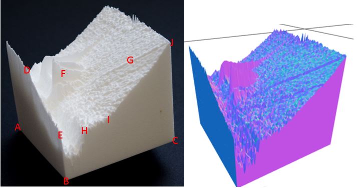
Figure 2: Lexis cube of log mortality for Finnish males between the ages of 0 and 90 years, for each year from 1878 to 2012. (Photograph of 3D printed sculpture, courtesy of University of Glasgow Photographic Unit, on the left; computer generated rendering of file used to print it on the right, available from : https://github.com/JonMinton/Statistical_Sculpture/blob/master/stl/individual/lmorts/fin_male_(1878-2012).stl. The labels are discussed below.
The height at different positions across the surface of the cube represents more than 12,000 separate mortality rate values, one for each combination of age and year. To start to interpret the cube, begin by looking for the three points A, B and C. These mark three of the four points which define the age-year extent of the cube; the temporal-chronological territory it maps. A indicates newborns in 1878, B indicates newborns in 2012, and C indicates 90 year olds in 2012. For each point at the base, consider the height of the sculpture above that point.
To think about how mortality rates at particular ages have changed over time, imagine taking a series of thin vertical slices along the plane containing points A, B, D and E. And to think about how mortality rates vary with age in any particular year, imagine taking thin parallel vertical slices parallel to the plane containing points B, C, H, I, J and E. With these heuristics for interpreting the cube in mind, some important features within this sculpture are as follows:
Looking across the A, B, D, E plane, from point A to point B, shows how the log of infant mortality has changed over time. Although this rate was continuing to decrease throughout the period, the rate of decrease increased sharply at around 1950 (point D), and has continued to fall at a similar rate year on year ever since (point E). As the cube shows log mortality, this increased linear gradient in mortality rate reduction represents a continued exponential fall in infant mortality levels, which has now continued for more than two generations.
Looking at the plane B, C, H, I, J and E, and moving from point B to point C, we can see the contemporary ‘schedule’ of log mortality risk with age. After the initial hurdle of surviving infancy (point E), the annual mortality risk then falls to some of the lowest levels ever observed in human history during childhood. Once boys become men, however, the mortality rate sharply increases (point H). It then appears to remain near to this risk plateau for slightly more than a decade (around the age of 35, point I), where it then starts to increase linearly on the log surface with age (I to J). In practice this means it exponentially increases with age through most of adulthood.
The quick mortality rise on the onset of adulthood, and the elevated mortality plateau which continues from around the age of 18 and 35, is one of the main ways that male and female Lexis surfaces differ. For females, the onset of adulthood leads to a much less steep increase in mortality risk, and instead the log-linear relationship between age and mortality risk becomes much earlier. The male mortality plateau represents the additional risks that young adult males experience, and in many cases seek out, compared with young adult females of the same age.
For data like Finland’s, which cover the period 1900 to 1950, another way that male and female Lexis cubes differ is in the level of additional mortality due to warfare, represented as spikes or shards which suddenly jut upwards during early adulthood – roughly the same age range as the male plateau. Although similar shards are visible for females, they are much smaller. The pattern of young adult mortality during World War 2 for Finland is distinctive in that it comprises two parallel ‘fins’, which can be made out near point F: high young adult mortality at the start of the war, high adult mortality near the end of the war, and much lower mortality in between. This distinct pattern is the demographic legacy of Finland’s unusual military history during world war two, comprising the defensive Winter War of 1939-1940, the Continuation War together with the Axis powers during 1941-1944, and the Lapland War of 1944-1945. The demographic records show that, for Finland, the first and last of these three conflicts were the most deadly, with the burden of excess deaths falling disproportionately on the youngest adults during the Lapland War.
Finally, Finland shares with many other countries evidence of cohort effects, manifesting itself as elevated ‘ridges’ of mortality which follow particular population groups as they age. One clear example of this is shown by noticing the ridge which runs from a few years before point J towards point G. This cohort-based ‘ridge’ meant that one particular cohort has tended to face slightly elevated mortality risks at almost all ages, an additional burden of risk which they carried with them J to point G. Tracing this ridge back from old age to infancy reveals that the unlucky cohort were of people born in the wake of World War 1. The same birth cohorts in many other European nations were similarly affected, and in the case of some other countries, like France, even more severely. Even though almost all people born from this cohort are now dead, the reasons why they experienced such prolonged elevated mortality risks are still a matter for debate, and could be related to the effects of the 1918 Influenza pandemic, as well as World War 1 itself, on their parents’ health and material conditions.
Discussion
In the above I have described some of the features and patterns revealed in just one of the Lexis cubes. But in total I have now produced more than forty, visualising not just trends in mortality, but also population sizes, fertility rates, and in the case of Scotland, crime rates as well. The potential for 3D printing as a method for making demographic and health data ‘real’, for making it an intuitive and interactive tactile experience as well as an exercise in statistical calculation, are vast and untapped. However, the STL files used by 3D printers to produce the data sculptures are available from the link below, and can be downloaded (with attribution) to be printed and explored directly.
Read more:
Minton J. Lexis cubes 1: From maps of space to maps of time. International Journal of Epidemiology Blog 2016: URL: https://ije-blog.com/2016/06/27/lexis-cubes-1-from-maps-of-space-to-maps-of-time/.
Dr Jon Minton is an AQMEN Research Fellow based in the College of Social Sciences at the University of Glasgow. His background and current work straddles the social and health sciences, with a common methodological focus on complex data visualisation and data science, including promoting open and reproducible research. To this end, a large series of files for 3D printing data surfaces based on data from the Human Mortality Database and Human Fertility Database, and the R code used to produce them, are made available from the following location: https://github.com/JonMinton/Statistical_Sculpture/tree/master/stl/individual

I enjoyedd reading your post
LikeLike